What have we learned? How do we apply it?
This blog is part of a series of conversations between Busch System’s Senior Advisor, Alec Cooley and Brenda Pulley exploring the science of recycling behavior in relation to bin and signage design.
Read PART ONE of the series.
Read PART TWO of the series.
Brenda: We’re back for the third and final installment of this set of blogs exploring the effectiveness of using words vs. images on bin signage. These in turn are part of a larger series where we’re reviewing the body of academic research to better understand the science of recycling behavior and how local facilities managers can better design collection bins and signage to influence correct sorting practices. In part 1 we reviewed a number of recycling-specific studies that tested the effectiveness of different sign arrangements. Part 2 focused on underlying cognitive research about how people process images differently than words. With this third blog we’re discussing the takeaways. What have we learned and how should we apply this to actually designing bin labels and signage?
Alec: We should mention a few qualifications before diving in. First off, this stuff ain’t simple! We’ve both read these papers multiple times over a period of months to distill this information. The concepts covered from the cognitive studies are quite complex.
Brenda: No doubt, it’s been a bit of a slog sifting through this research. I’ve lost track of which COVID variant was dominant when we started out!
It’s also worth noting this is still an active area of exploration. When we talk about the degree to which familiarity, complexity and the other attributes impact people’s reaction to images, the papers are careful to point out unresolved questions about how these different qualities interact and potentially strengthen or weaken the influence of the others. Give the Picasso treatment to something very familiar like a smart phone, and it shouldn’t be a surprise that the degree of abstractness/ concreteness of that image will affect the speed with which people process it’s meaning.
Alec: And full disclosure, neither of us has a science background. So the degree to which we’ve accurately applied these concepts to a recycling context… how do we put this gently? …could have limitations.
Brenda: All that said, Alec, what are your overall impressions?
Alec: There’s no doubt we’ve seen compelling evidence about using images. If you boil it down, reaching people with limited attention requires efficient communication. That’s what images do. But to your point, there’s a lot of nuance that keeps me from simply telling people to ditch words. Words have their own strengths that come in handy.
If you recall from part 2, one of the papers, McDougall, Cury & Bruijn (1999) focused just on defining a rating system to measure the degree to which icons display characteristics like concreteness, complexity and familiarity. That underscores how this is not a black and white question of all images are better in all situations. Further research could point toward using certain images or words in a given context based on their unique characteristics and the items they’re intended to depict.
Brenda: Agreed on both points. The need to communicate lots of information quickly, especially in public spaces, lends itself to the efficiency that images provide. But there are situations where the broad net that words cast (e.g. categories) plays to their strengths. Until more studies dig into this further, I think we have some broad outlines to work from, but we’re still fundamentally reliant on our best judgement to adapt these to on-the-ground situations.
Alec: This is a little bit of a tangent, but just as images have unique characteristics that influence people’s reactions, the specific settings and bin locations have characteristics that come into play. How we interact with the waste basket under the sink in our home is much different than with bins in a public park. And even within a park, the bins placed next to a parking lot or trail head experience very different patterns than bins placed in the middle of a sports fields. It would be interesting to develop a rating system the different characteristics for bin arrangements as well as specific locations.
Brenda: That’s an interesting idea. Off the top of my head I can think of half a dozen measurable factors you could apply. Physical proximity to points of waste generation like a coffee shop. The degree of diversity of the items in the waste stream. The cultural fluency of typical users in a location. Flexibility of local recyclability standards. Level of stress or distraction typical to usage patterns.
Alec: You could argue bins placed at the entrance to a subway station are more likely to be used by people racing to make their train. But down on the platform people are often just standing around waiting for the next train to arrive. That will definitely impact how they interact with the bin.
I think we’ve found our next project!
Brenda: I think you’ve found your next project.
Alec: Fair enough. I’ll need something to do when I retire.
But coming back to the topic… Caveats in mind, what wisdom do we have to impart to our readers?
Using Words and Images Together
Brenda: We’ve been talking up this point about an either / or situation. I think this a false dichotomy, and that in many, if not most cases, it makes sense to use them together in some combination.
Alec: That’s a pretty bold statement given that, with one small exception, none of the recycling or cognitive studies we reviewed even bothered to mention this option. Which frankly, seems a little odd.
Brenda: Well, back up. All four recycling studies included one or more sign conditions that combined words and images in some form. But with the exception of Ahmed, Khanani & Koshy (2016), none of them separated out results for the combination of both in contrast to words-only vs images-only. And Ahmed didn’t dwell on the distinction or try to explain the relative performance.
Alec: And while they saw a significantly higher diversion rate for the combination in one of two locations, we have enough questions about the underlying methodology to treat these results cautiously.
So back to your statement, what’s your thinking?
Brenda: Honestly?
Alec: I would expect nothing less.
Brenda: Knowing how words and images exhibit different strengths, my practitioner’s intuition says they can be triangulated to reinforce each other. Maybe not all situations, but in many.
Bin signage in the Austin, TX airport showing photos and words together
Alec: I have to say, I agree with you. We both belong to that elite club of slightly-weird people who can’t resist glancing inside bins we pass to see how clean or dirty the material is. Stare into enough of them and you get a feel for this kind of thing. The combination of both words and images feels right to me.
Brenda: If an old sea captain can “feel” a storm coming, I think a couple of grizzled recycling veterans can claim license on this.
Alec: Well, in fact there appears to be actual science to backup our intuition. Here’s where we pull back the curtain to reveal one last surprise academic source.
Brenda: I’m not sure I can bring myself to read another study…
Alec: Then you’re in luck! It’s not a study but a chapter from a book called Multimedia Learning (2009) by Richard E. Mayer. It’s chock full of science about “dual channels”, “active processing” and other theories. We invite anyone interested in these to pick up a copy. We’ll skip the particulars, and just crib a sentence from the chapter introduction, “People learn more deeply from words and pictures than from words alone.” They left off the “…or pictures alone”, but that’s pretty clear from the chapter itself.
Brenda: Ok, so here are two possible theories that could apply this to a recycling context: By themselves words are inclusive, and have the potential to unintentionally invite outlying waste items that technically fit within the definition but aren’t in fact recyclable. A corresponding image(s) displayed next to the word could serve as a guidepost to illustrate the most common acceptable items in that category, and hopefully extend an association to closely similar items. Conversely, by including words and not just images alone, you communicate that it is, in fact, intended to include a range of items, a category beyond just the specific items. So, think about the word “Paper” for example. By itself it could include non-recyclable items like napkins or paper food packaging. By placing images of office paper and, say magazines next to the word, they frame “Paper” in the context of the sub-grouping of print and writing paper. By leaving out images of paper items related to food or packaging, people will intuit these types of paper are excluded. Flip this around, and only presenting images of office paper or magazines could be narrowly interpreted to imply those two specific items, while adding the word “Paper” gives people reason to think more broadly.
Then a second working theory could be that different people simply respond better to one or the other, and using both increases the overall percentage of people who ultimately get it right.
Alec: I think these are both reasonable theories. It would be interesting to see how others interpret this.
Brenda: What’s clear is that there’s no one-size-fits-all answer to for every situation. So let’s break this down where we think conditions should influence how these are presented on labels and signs. The following situations focus on where we think words or images have particular strengths, but how to apply these still requires judgement based on the unique situation. Where one has strengths doesn’t necessarily mean the other should be left out entirely. It may be that you simply want to increase the prominence of one in relation to the other or otherwise adjust their presentation.
Where Words Have Advantages
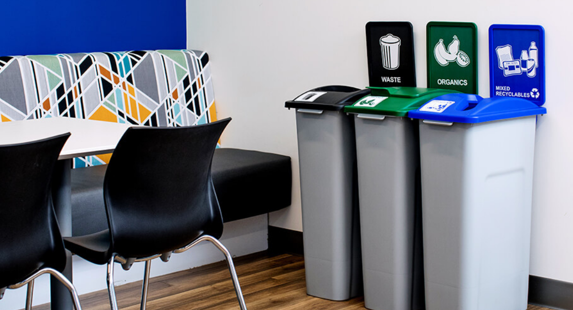
Brenda: First a quick review. Labels and signage can serve two distinct functions. The obvious one is to inform people what items go inside a bin. But the other function is similar to the color distinction and even the shape of a bin opening, to act as a visual prompt identifying the essential collection stream of the bin itself. They let the person know at first glance that this bin is for recyclables, that one is for organics, etc. Ideally they perform both purposes with two levels of information: the large, bold display people see as they approach from 10 or so feet away, and the smaller print with details they see standing next to it.
The first function to identify the collection stream is essentially the task of defining a category. Given what we’ve learned, this task should lend itself to words.
Alec: Makes sense. General words like “Trash” “Recycling”, “Composting” communicate this first level of information well. But I’d argue that symbols like the recycling mobius or a stylized image of an old school trash are also pretty effective to identify the collection stream.
Brenda: I won’t disagree. But what about a symbol for composting? There isn’t a universally recognized symbol foe that, so you’re left to rely on a depiction of an item like an apple with bite taken out of it. Is that bin just for partially eaten apples? Most people will get it, but at a minimum there’s the potential to slow people’s reaction time.
What I would be more nervous about is using photos in this context. Remember our pet theory, that icons or symbols can straddle the line between a general category and specific items. But there is no photographic equivalent of a mobius symbol. You have no choice but to depict a specific item or items. You want to do that with the secondary level of information, but not necessarily when people give that first glance at a distance.
Ok, score one for words. Your turn.
Alec: I think we can cautiously apply this same logic to the secondary level of information in certain situations. I’m thinking of situations where the various types of waste materials being generated conform more or less to distinct, logical categories that can be communicated in a word or two, words.
Regardless of words or images, the principle stands that you want to minimize the overall amount of information as much as possible. So the question is where can you list a word or two, knowing that people will immediately intuit the full range of items it encompasses, and just as importantly, have a clear expectation whether the item they’re discarding belongs or doesn’t. It’s a question of terminology, as well as the relationship of similar items to each other and what’s actually being generated in a specific location. What pops first to mind is using “Paper” in offices or other situations where there’s less likely to be a proliferation of non-recyclable types of paper like food packaging, napkins, etc. You can get away with and want to encourage people to toss in the bin whatever items that word suggests to them.
Brenda: That assumes there aren’t, in fact, lots of non-recyclable paper coffee cups or food packaging from people eating lunch at their desk.
Alec: Fair enough. And that’s why it’s important to do waste audits.
The word “Plastics” by itself would be the classic anti-example of this situation. The category defined by that word is simply too murky. People don’t have a clear idea what types of recyclable and non-recyclable plastics that should include.
I’ll go out on a limb with a theory about the Shahri, Vandenbergh & Samuels (2018) findings. Recall how words resulted in greater sorting accuracy than images with the compost stream in contrast to images performing better with the recycling and trash streams. Could this somehow be related to the same effect we saw with the George Washington University / Keep America Beautiful study. Remember, in the latter study, they found that most people saw the word “Paper” and understood that included paper bags. But a large percentage of people looked at a photograph of a stack of paper and with no other guidance available, assumed that bag should not be included. Coming back to Shahri, the types of items they accepted as compost generally conformed to categories that people could grasp with a few words. “Food Waste”, “Compostable plates, cups and utensils”. The specificity of the images used on the alternate signage left too much to question. Does a photo of a compostable PLA cup also extend to a Starbucks coffee cup? Should that same cup, which looks to the untrained eye like any regular plastic cup, be an indication to include a water bottle?
I’ll go even further out on the limb tying this to a point made by both the Ahmit and Wu studies about familiarity.
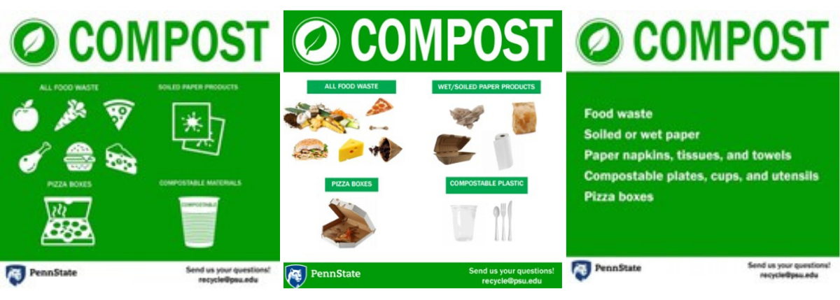
Three sign conditions used in the Shahri, Vandenbergh & Samuels (2018) study.
Brenda: Hmm, that limb is starting to droop.
Alec: They both said a version of the same point: where items depicted are less familiar to a person, words may perform better than images. The wide net of meaning that words cast provide breadcrumbs to lead people toward an understanding, whereas an unfamiliar image simply leaves people to guess what it is. Sorting food scraps, and especially compostable packaging is still a novel experience for many people. They may recognize a photo of what appears to be a plastic cup, but its compostability isn’t obvious from a photo. At a minimum, they’re going to puzzle over it. Which of course results in lower efficiency. Put Homer Simpson in that situation, and he’ll hunch his shoulder and move on.
Brenda: I’m on board with your first point, about words working better with obvious-to-define categories. But I’m not quite ready to say it explains the Shahri results. You put your finger on an essential fact, that composting food scraps and packaging is still new, uncharted territory for many people. Words performed better in this case, but both Shahri and Wu showed worse contamination across the board for the compost stream. It’s hard to say the inherent confusion people still have about these didn’t somehow introduce other, less predictable variables. Replicate these same results with a few more studies and we’ll see if there’s room for another person on that limb.
Alec: Fair enough. Let’s pivot to situations that play to the strengths of images.
Where Images Have Advantages
Brenda: Images appear to have advantages across a range of situations, but there are a couple that seem pretty cut and dried. The obvious one is where you have a significant population of non-fluent English speakers. There’s no rocket science to understanding how images transcend language barriers.
Another would be locations that generate a small number of different types of waste items, but a large quantity of them. So, take for instance a cafeteria or food court where you’re going to see the same brand of soda bottle, the same types of plates or bowls, etc. generated over and over.
Alec: Call it the Galapagos scenario, where you trade biodiversity for volume. You can count all the different types of animals – turtles, albatross, iguanas, etc. on your two hands. But there are gazillions of each species everywhere you look.
Brenda: I always know I can count on you for an analogy…
Alec: At your service.
Brenda: That lack of packaging diversity gives sign designers freedom to call out specific items with the hyper-specificity of photographs, and potentially capture a higher percentage of recoverable materials than one could reasonably expect in other situations. They don’t have to make the compromises, using more generic messaging for fear of excluding items that don’t fit onto the label or sign. So, when people see the photograph of the same bottle of A&W root beer they just drank, they instantly know where it goes. If you’re confident the packaging items being generated aren’t going to change in the foreseeable future, or if you have the ability to replace signage cheaply and easily, I wouldn’t mess around with icons or generic photos, I’d go all-in using photos of the specific brands.
Alec: If efficient comprehension is the key to directing the actions of someone focused on other things, this is a unique setting where concreteness pays off. In fact, some have gone a step past photos and one-dimensional signs to place shadow boxes above bins displaying the actual packaging items sold.
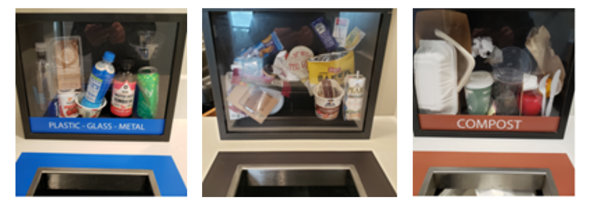
Shadow box signage with specific waste items.
Brenda: The third situation that would play to the strengths of images is on-the-go locations where you’d expect people to be more distracted and hurried than normal. I think of downtown streetscapes, airports, walking trails. If a cafeteria with a controlled range of waste items presents an ideal opportunity to recover a higher percentage of clean material, these settings I’m describing are the nightmare opposite. There’s a diverse range of waste items being generated. You have a transient population with less familiarity of how and what is recycled at a given location. And you have people who are in transit and less likely to focus sustained attention on the bin label. Images may not have the flexibility of words to be inclusive to everything being generated, but perfect sorting is not a realistic option. This is more of a triage situation where you need to get across the most critical information as efficiently as possible with the hopes of guiding the right sorting action for the common priority items. Images give you that efficiency even if they risk excluding less common items.
Alec: Do you go with photographs or stylized icons in this situation?
Brenda: Good question. I’d love to see someone study this closer. My gut says icons. You want the efficiency of an image, but not necessarily the specificity of a photograph. Don’t leave people to guess if a water bottle is a stand in for soda, blur the distinction with a stylized image that conveys both.
Closing Words
Alec: And that brings us to end of this mini-series of blogs about using image and words on signage. I wouldn’t say we’ve solved all the mysteries of the universe but we have some solid takeaway’s.
Brenda: Of course there are a number of other critical questions to address about designing signage. Which words or images should you actually use? How much information can you reasonably add to a sign before people tune out?
Alec: The good news is these and other aspects of bin and signage design have been explored by a range of other academic studies that we’ll look forward to reviewing in future blogs.
As a reminder, you can find a Google sheet that catalogs these and other recycling studies that we’ve assembled.
Are you involved with or familiar with ongoing research into these issues? We’d love to hear about your work and learn about any studies we haven’t come across. Please reach out to me at alecc@buschsystems.com.
In the meantime, Brenda, it’s been a pleasure wading through this research with you. I look forward to the next installment.
Brenda: Likewise. Until next time…
****
Missed the earlier installments of The Use of Images vs. Words on Recycling Signage series? You can still find PART ONE here, and PART TWO here.