This blog is part of a series of conversations with Brenda Pulley exploring the science of recycling behavior in relation to bin and signage design.
Alec: Brenda! How are you?
Brenda: Alec! I’m hanging in there. And you?
Alec: Besides feeling a little cooped up, just great. I’ve always said I’d get to that stack of books I’ve been meaning to read if only I had 9 months of imposed isolation. Turns out it isn’t true.
Brenda: Yup, that’s just a lie we tell ourselves. I’ll bet you’ve had more success with your Netflix queue.
Alec: You know me too well. Anyway…
To bring our readers into the conversation, this is the first of a series of conversational blogs where we’ll explore the key learnings about recycling behaviors from different academic studies. Over the past 30 years, there have been dozens of studies asking different variations on how to get people to recycle and to do so correctly. The problem is that much of this knowledge shows up in academic journals, and too frequently never filters out to the recycling managers in a position to use it. A lot of the information is couched in behavioral psychology terminology and concepts that can frankly, get pretty abstract. Our goal with these blogs is to pull the studies off the shelf, blow the dust off and break their results down into concrete takeaways a recycling manager can put into practice.
Brenda: In other words, translate these academic studies into “recycling manager-speak”.
Alec: That’s a more succinct way of putting it.
Brenda: Another goal we have is to bring real-world context to the academic discussion. As a recycling manager interacting with the public, you sometimes read the results of a behavior study and think, “so what”? The design of a study may reveal a deeper understanding of psychology but have no practical value to the work you’re doing. What are the questions recycling managers are looking to answer, and how can they inform planning for future research.
Alec: Close the knowledge loop as it were.
Brenda: You got it.
Alec: Before we go further, perhaps we should introduce ourselves?
Brenda: That would be entirely appropriate.
Alec: Brenda and I worked together along with several other colleagues with Keep America Beautiful (KAB)’s recycling department for, how long would you say?
Brenda: Well, I arrived in 2011, so that would be roughly 7 years.
Alec: Sounds right. You ran the department for much of that time, working with the rest of the team in the Washington DC office, while I worked remotely from Charleston, SC. BTW, we never did get around to my offer to host a staff retreat in Charleston. Shame, because I had the perfect place in mind. Right on the water. Easy access to the beach. Stocked bar for the end of the day.
Brenda: Perhaps that’s why it never happened… But seriously, that is too bad. It would have been a lot of fun.
Alec: Ok, staying focused…
Brenda: Yes! The team’s work was directed at producing “off the shelf” programs and resources to support local recycling coordinators engaging their communities. America Recycles Day and RecycleMania (since rebranded as Campus Waste to Zero Waste) are both successful annual campaigns we helped to build. The I Want to Be Recycled series of TV, billboard, radio, and print advertisements grew into one of the most successful cause-oriented PSA campaigns in the Ad Council’s history.
Alec: I’m particularly proud of the away-from-home projects we did. A lot of focus has rightly gone into improving residential recycling. But that’s tended to overshadow the need for better information and resources about how to recover material from the workplace, schools and on-the-go locations like parks, venues and downtown areas. The Recycling at Work study you spearheaded into deskside bin configurations generated concrete takeaway’s that have helped improve recovery in office buildings across the country. Our colleague, Kelley Dennings, led another project about bin shape, color and signage in partnership with George Washington University.
Brenda: Yup. We’ll come back to this. One of the things we came to appreciate is just how much influence the messaging, signage and the physical design and placement of bins have on recycling behavior. There are a number of general best practice guidelines, but as anyone who’s set up an away-from-home recycling program knows, there’s still a lot of mystery when we dig deeper into these.
Purdue University Recycling Signage Study (2018)
Alec: And that’s actually a good segue into the focus of this blog. Another project we did at KAB was to partner with Purdue University on a study exploring how sign messaging can influence people’s sorting practices. For some background, we had previously provided a grant of recycling bins to the school. The school’s sustainability director, Michael Gulich, was very engaged and shared some of the same questions we had about how to get people to use the bins more reliably. That led to a conversation with Dr. Torsten Reimer, a psychologist and professor in the Brian Lamb School of Communication, as well as director of the university’s Communication and Cognition Lab. Dr. Reimer designed the study and produced a report in 2018, Overcoming Barriers to Recycling: The Role of Knowledge and Social Norms. The results and charts we’ll be covering are taken from this report.
Brenda: Which you can find published online.
Alec: Dr. Reimer and his team have presented the findings at a number of academic and applied conferences, including Cognitive Science Conference (London, UK), the annual meetings of the International Communication Association (Washington, DC), the National Communication Association (Dallas), and the European Association of Social Psychology (Krakow).
Brenda: Don’t forget the AASHE higher ed sustainability conference in Baltimore.
Alec: How can I? We shared a panel together. BTW, I reached out to Dr. Reimer a few weeks back, and he let me know he’s done additional research since this report that he expects to publish in the near future. Something to look forward…
Brenda: Good to know. So, the original project actually included four separate studies.
- Two of them, one in the lab and the other in the field, specifically looked at the effects of different sign messages.
- A third computer-based study looked at the effects of perceived convenience on recycling by asking people to say how far out of their way they’d go to discard items in the correct bin. This distance study was interesting, but for the sake of brevity, we’ll come back to this with a future blog.
- The fourth study, done in the field, looked to measure if normative messaging on signage had an impact on recycling.
Alec: Spoiler alert on this last normative messaging study: It didn’t.
Brenda: Again, this is worth a closer look with a future blog, but let’s focus for now on the two signage studies.
Alec: Let’s peel back a few of the layers on what was studied, what were the key findings, and most importantly, what are the takeaways relevant to away from-home-recycling design. The Purdue research was designed to build on the findings of the GWU survey project. That online survey asked approximately 1,200 people to identify which features made recycling most recognizable, covering a range of categories such as bin shape, color, and signage. While the results indicated that color (blue being the most recognized for recycling) and shape matter, it showed that signage with words, specifically cans, paper, bottles PLUS images performed the best.
Brenda: Taking those findings and building on gaps in the industry’s research, we worked with the Purdue team to design the research project. Both the lab and field studies tested different signage conditions to see how they may influence people’s sorting between a recycling bin and trash bin. The lab study involved 250 paid volunteers being presented with 32 various items and instructions to place each item in a bin based on three different signs displayed. The first sign showed the very basic “Trash” and “Recycling” words with a corresponding image of a trash can and mobius triangle. The second kept the same image but switched out the wording to list three broad categories of accepted materials (trash: “Food”, “Wrappers, “Tissue”; recycling: “Cans”, “Paper”, “Bottles”). The third kept the same wording while adding additional images that corresponded to the listed materials. The field study that followed expanded this to five different messages on special signs that projected up from the top of the bins. These sign variants plus a sixth control condition with no sign were randomly distributed to locations across multiple floors of an academic building with a mix of offices and classrooms.
Alec: I liked that this included both lab and field study. Lab observations are important, but field data goes another step to reveal if signage actually influences their actions under real-world conditions.
Brenda: I agree. Field observations, you could say, “keep it real”.

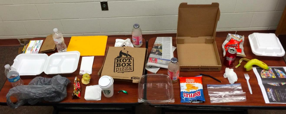
Bins in the field showing one of the sign conditions
Highlights From the Study Data
Brenda: Let’s start by giving a quick shout out to the Purdue team of research assistants and sustainability staff. To get the field data, they spent 8 weeks sorting over 8,600 waste items from 720 recycling and trash bin loads.
Alec: We’ve both done enough waste audits to appreciate how much fun this must have been. Seriously. Well, kind of.
Brenda: Kind of…
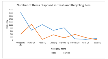
Those 8,600 items were categorized into 448 distinct types of items. Roughly 67% of the items were discarded in trash bins and the other 33% in recycling bins. It’s worth noting that the most detailed of the sign conditions used words and icons to identify a total of six types of items.
Alec: The operative word is “types” of items. With multiple images used to indicate a “type of” item in some cases (e.g. cardboard box and stack of documents to indicate paper), there are up to 10 distinct words or images for users to comprehend. This is a question to come back to, that’s an awful lot going on for a public space bin. But let’s keep going.
Brenda: Agreed. Let’s come back to that.
The audits were used to:
- Determine the specific items disposed
- Which items were more frequently disposed of correctly
- Which items were more frequently disposed of incorrectly
- Affects signage may have on recycling behaviors
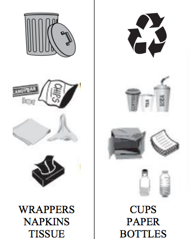
Example of the words and icons used with one of the signage conditions tested.
Alec: As one would expect, a small number of categories accounted for the bulk of commonly discarded items. Of the 8,600 items pulled from trash and recycling bins, almost 90% fell into just eight broad categories. Just worth noting as we strive to simplify messaging.
Results of the Study
Alec: So let’s cut to the chase. Did the signage have an impact on sorting behavior?
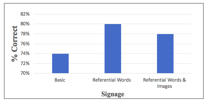
Brenda: Some, but not a lot. In the lab study, the two sign conditions that listed referential words (i.e., cans, paper, bottles) showed 5% better sorting accuracy over the basic sign listing just “Recycling” and “Trash”. Adding images alongside words, however, had a negligible affect. Similarly, results of the field study showed there was a 4% point increase in accurate sorting with both the condition using just words and the one with both words and images as compared to no signage (just relying on different color bins and the mobius loop on the bin itself to guide behavior.) There was NOT a statistically significant difference between the condition with just words and the condition with words plus images.
Alec: Woah! So adding images made no difference?
Brenda: Not enough to count.
Graph shows sorting accuracy of the 3 sign conditions from the lab study.
Alec: Let’s unpack this further. Does it mean images simply don’t matter?
Brenda: I don’t think we can say that. As you pointed out, other studies have shown the positive influence of images. It’s hard to say, but a couple of things could account for this.
It’s not totally surprising in the case of the lab study, since volunteers were given specific instructions to study the signs and react. With that level of concentration, you could argue the fact the images reinforce the same items already spelled out simply means people absorbed all the information there was to absorb. But taking the test into the field introduces a different dynamic. Namely, people are much less likely to actually concentrate on the sign. They’re busy moving about their day, and not necessarily focused as they toss items into a bin.
Alec: Yes, this is a crucial point that’s easily lost on anyone who doesn’t gaze into waste bins for casual pleasure. In the real world, some people look at the sign and others don’t. But even in the best of circumstances, a “look” is often just a fleeting glance. In that situation, the question becomes what will stand out and be more likely to register during the half-second of that glance? The theory behind using images is that some people simply comprehend visuals faster than words.
I’ll theorize one factor why the field study showed no benefit from the signage could be the images themselves. There’s a whole sub-topic for studies comparing drawn images versus photographs, and even using shadow boxes that display actual examples of common items. The essential question remains, to what degree the images used are instantly recognizable. It’s conceivable the drawn images used with the Purdue project didn’t click fast enough in people’s minds.
Brenda: Well, and there’s also the question of information overload you alluded to earlier. Basic communications best practices suggest the same issue of limited attention span will cause people’s eyes to simply glaze over when presented with too many words or images. Is this a possible factor with the field study?
Alec: Good question. The report we reviewed doesn’t dig into this, but we can hope Dr. Reimer addresses the question with the publication he’s working on.
Brenda: There’s one other finding from the study worth noting. Of the items found in the field bins, 87% corresponded to one of the broad material categories covered by the signage. Do you find any significance in this?
Alec: I have to admit I’m not sure how to respond. On one hand, its good to know you can cover the vast majority of items in the waste stream (academic buildings at least) without having to present a detailed laundry list on the sign. But the devil is in the details. Yes, signage can be inclusive of a large percentage of items, but at what point does it risk verbiage or imagery so broadly generalized that ambiguity starts to creep into people’s comprehension. You cast a very wide net simply listing “plastics”, but lord knows how many directions people will interpret that. I think most recycling managers will agree the betting man (or woman)’s dollar is best placed somewhere in the middle. Play it safe with language and images that thread the needle, encompassing the widest range of acceptable materials while clearly excluding the commonly confused unacceptable items.
Brenda: Despite the multiple clichés and mixed metaphors, I have to agree.
Key Takeaways From The Study
Alec: That’s where we’ll need to leave it for today. So Brenda, can you sum up the main points of interest to recycling managers?
Brenda: Here you go: Simple, prominent signage matters. A basic label with “Recycling” or the mobius loop only gets you so far. Simply adding signage to the top of the bin provided a visual cue that improved proper disposal by 4% points.
Alec: Not enough to declare victory, but combined with other best practices it moves you incrementally closer to the goal.
Brenda: My final point is that we need to study this further so we can gain additional insights into what kind of signage messaging may have the most impact.
Alec: And there you have it. Stay tuned for our next blog where we’ll look into some of these other signage studies.
Let’s Network!
In the meantime, I want to share a resource for anyone interested in the science of recycling behavior, especially as it relates to the away-from-home setting. I’ve been assembling an online Google Drive database of all the academic research we’re aware of related to signage, bin design, placement and other factors that influence “on-the-go” recycling behavior. We’ve been slowly making our way through to categorize these by specific focus of study, flag key findings, and more. It needs more work, but this is a good launching point for anyone doing a literature review on the topic. A separate set of Google folders has many of the actual papers available to download (if available in a public domain).
We’d like to hear from you. Whether you’re an academic or just trying to get people to use bins correctly, reach out to let us know what your interest is, share new or upcoming research we may not be familiar with, or simply to bounce thoughts off us.
Alec: This was fun, Brenda.
Brenda: It was! Until next time…