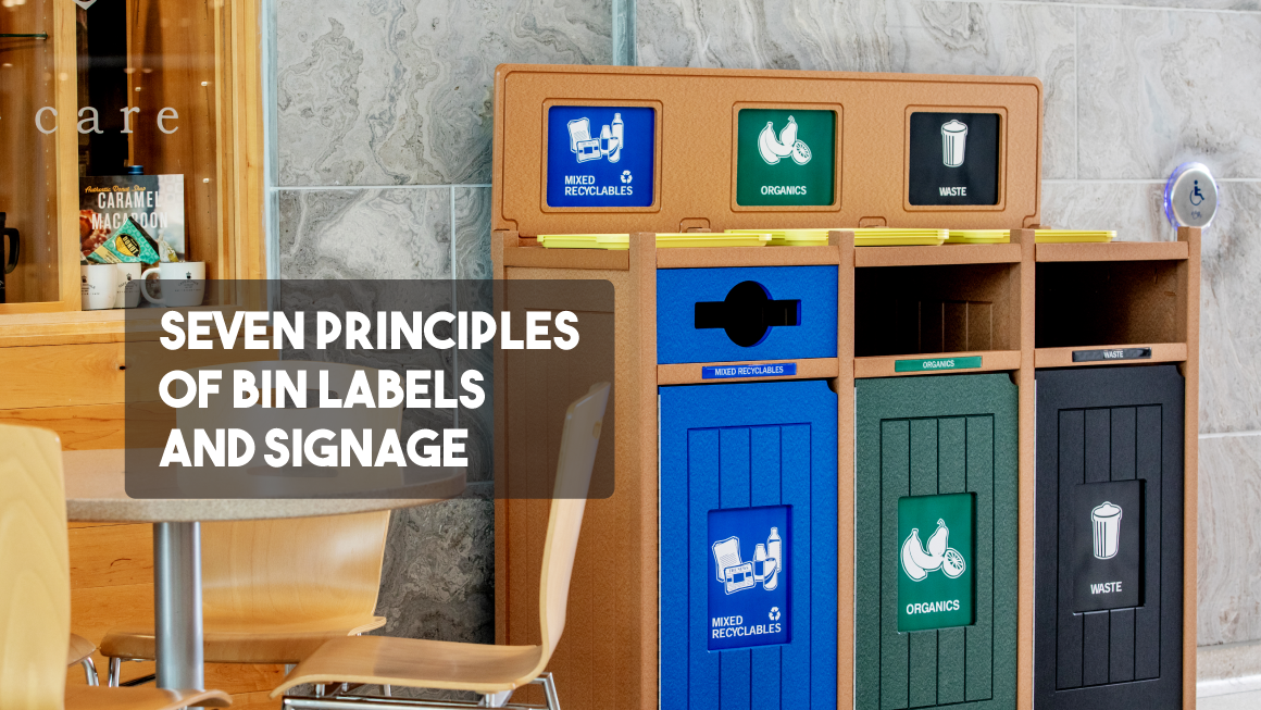
A traveler stands in an airport concourse with a boarding pass in one hand and a half-finished coffee in the other. A set of recycling and trash bins is ahead. The traveler has seconds to decide what to do. The traveler glances at the bin labels, hesitates, and then drops the cup into one of the openings. Whether they choose the correct opening depends a lot on what the labels present.
Trash is simple. You set out a bin, people use it, and someone empties it. Recycling is a lot more complicated. When not implemented thoughtfully, items end up in the wrong bin. Contamination spreads, recovery rates fall, and decision makers wonder if the program is worth the effort.
Labels and signage are an essential part of making recycling work. They do more than name a bin. From a distance, they signal that more than one option exists and prepare people to decide before they arrive. Up close, they identify the streams and steer users, to the extent possible, toward the correct opening.
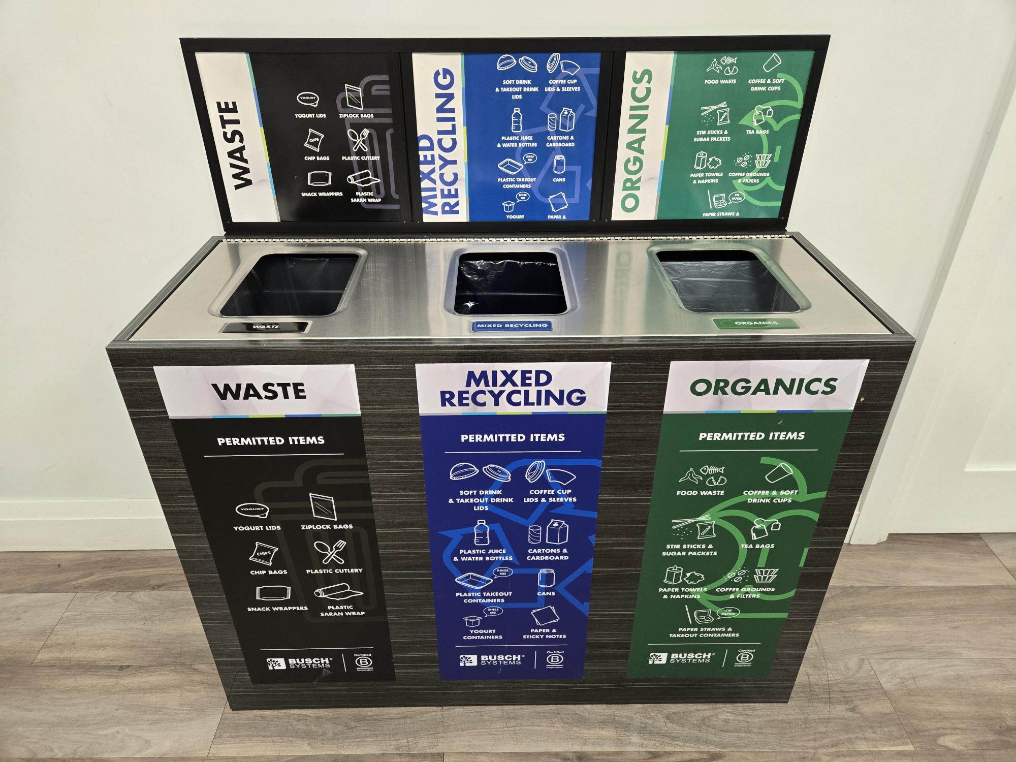
Quick note: labels and signage often get used as interchangeable terms, but they can have practical differences. “Labels” are typically smaller, placed in proximity to a bin’s opening, and limited to a word or two and possibly an icon to identify the waste stream. What I think of as “signage” may identify the stream but also list specific acceptable items. Signage is larger and usually placed on the side of a bin or with a frame that sticks above the top. All bins have some form of label, but not necessarily separate signage. Having made this distinction, there’s enough functional overlap that, for simplicity’s sake, I’m going to use “label” as a catch-all term except with points exclusive to one or the other.
Sorting mistakes happen for several reasons. Some people are confused about recycling rules or ambiguous packaging. Others toss items in as wish-cycling, hoping something might get recycled even when they are unsure. Overwhelmingly, though, people simply are paying close attention. Waste has no value. That makes discarding it a low priority for people leading busy lives. Someone cleaning up from a picnic may allow five or six seconds to understand where items go. Just as often, though, a casual glance leads to an impulsive toss. Labels have the impossible job of anticipating these situations to use that fleeting moment best to guide their toss in the correct direction.
Designing for this reality blends science and intuition. Dozens of academic studies have examined optimal designs for recycling and waste bin labels, but the quirks of human behavior and individual locations often leave managers to rely on their gut judgment.
Seven principles rise from the research and years of field practice. They won’t eliminate mistakes, but they will help minimize cross-contamination and keep recycling viable.
- Focus on Critical Information
Including more information on labels might reduce confusion, but in practice, it’s likely to cause inattentive people to tune out entirely and miss the critical details. Determine what’s essential. What will guide the highest percentage of users regarding the most common items or most commonly-confused items? And then be ruthless, eliminating information that’s merely important. Instead of listing “aluminum cans” and “steel cans”, use “cans”. Avoid listing prohibited items unless there’s a significant issue with a specific contaminant. Larger signs may allow room for more information, but even then, you need to be careful. Instead, use a QR code pointing to a comprehensive list for the small percentage of people likely to put the knowledge to use.
- Understand your Waste Stream.
Programs that track waste types can prioritize what’s critical. If most users discard recyclable bottles, list ”Plastics” on the label. But if there’s a lot of non-recyclable plastic film or wrappers, you may want to go with “Bottles” instead. Unless there’s a lot of glass too, in which case you may need a longer “Plastic Bottles”. The choice depends on what people actually throw away and where they make mistakes.
Run a waste audit if possible. If not, stand by the bins and look. Regular checks show what ends up misplaced and what people hesitate over. Use evidence to decide the language and images that matter most.
- Use Images and Words Together.
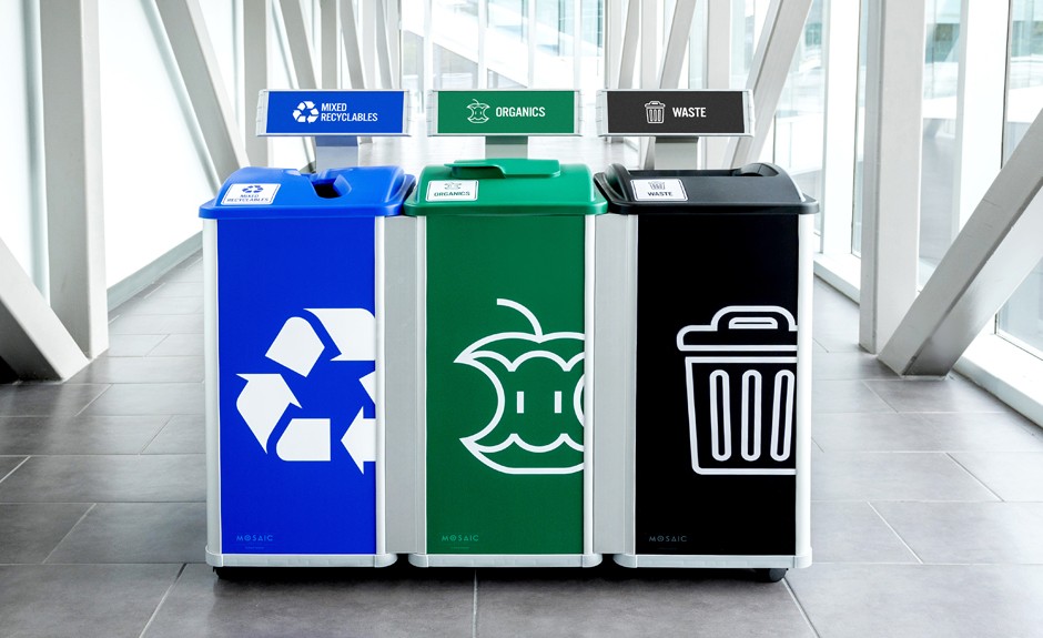
Words define broad categories such as “Paper”. To be specific requires more words, which makes them less efficient. “Office paper”, “Newspaper and magazines”, etc. Pictures show specific items. They communicate the exact object efficiently but leave people wondering about what the image does not depict. Users may assume a picture of a plastic soda bottle includes glass jars, but they can’t be sure.” Stylized icons straddle the line and represent either a single item or a group of items, depending on how the artist draws them.”
Depending on the situation and nuances of the waste stream, there is a logic to using both to strategically define the range of items accepted with greater or lesser specificity. Also, different people process information in different ways. By combining both words and images, you can draw on the strengths of each to have a reinforcing effect.
Looking for deep dive on this topic Read a three-part series I wrote a few years ago about the use of images versus words on labels.
- Adapt to the situation.
The typical activity patterns of a location can affect how a user responds. A person is less likely to feel stressed, and by extension, have the attention to absorb more nuanced information on a bin label in their office break room than running for a connection in an airport. Extra detail in a break room is internalized and improves their accuracy in the future, while it becomes irrelevant to the traveler who never returns to that airport. Images are more important in the airport to help international travelers.
A university cafeteria or sports venue comes with the advantage of a high volume of the same types of food and beverage packaging. You can label a compost bin with a photograph of the specific compostable food clamshell served in a cafeteria, and users immediately recognize where the item they are discarding goes. This specificity allows for highly accurate sorting that is impossible in a park or downtown area that has no choice but to communicate broad categories that can anticipate the diverse range of items they may receive.
- Labels Must Be Easily Understandable
Labels must do more than present information. They must communicate meaning and do it fast enough for a limited attention span to absorb. Start by carefully considering how your local audience will respond to specific words. Which words have an obvious association?
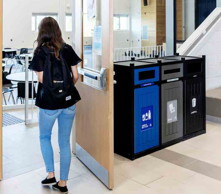
Avoid industry jargon like “single stream” or plastic resin codes like HDPE that aren’t intuitive to non-professionals. Be sensitive to the cultural subtleties of different words. “Trash” is commonly used to identify bins in the US, but Canadians tend to use “waste”. “Landfill” is popular to identify trash bins, but research suggests it causes people to wish-cycle more often.
Pictures and icons help people who are not fluent in the language. For any user, they communicate an association very quickly, unless they require a second glance to comprehend. A poorly drawn icon or a picture of an ambiguous item loses people if they must pause to interpret its relevance to the item in their hand.
- Make it Visible and Accessible.
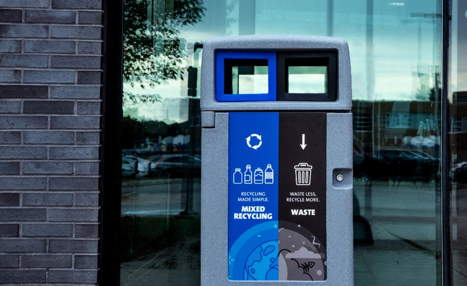
People often minimize the label in the tug between form and function, but that choice misses the point. Labels must be visible to work. For sight-impaired and inattentive people, a larger 6-inch typeface is ideal for identifying the waste stream. Placing the label near the opening is a common-sense solution to guide the action at the moment of decision.
Position labels so people approaching from different directions can see them from a distance. A front-facing sign may not help someone arriving from the side. Place labels in the approaching user’s line of sight. This consideration is also where larger signage comes into play. Studies show that signage placed above the bin can reduce cross-contamination by 20% or more, simply because it catches a person’s eye.
- Be Consistent.
You may have noticed how Coca-Cola bottles are red. Not sometimes. Always. The principles of branding apply to recycling. Bins and signage that look different from one location to the next slow people down, forcing them to reinterpret the situation constantly. Bins and labels with consistent wording and icons, graphic style, aesthetic design, and color distinction between waste streams provide busy people with a mental shortcut, allowing them to use experience to speed their reaction in the moment. Ideally, there’s already a local color standard to apply. But if not, blue is most associated with recycling, green with compost, and gray or black with trash.
Together, these seven principles form a clear guide for program design: communicate efficiently by keeping labels simple, understand your waste stream so categories match reality, adapt to the setting, use images and words together for faster recognition, speak the user’s language with familiar terms, make signage noticeable, and reinforce expectations with consistent messaging and design.
These principles create a framework that acknowledges the realities of how people use waste and recycling bins. It anticipates the fleeting attention people give to discarding waste by removing the friction points that slow them down.
There are no Hail Mary touchdown passes in recycling. Even with the strongest design, no label or bin system can eliminate cross-contamination. But each of these principles brings incremental improvements. Together, they minimize the percentage of items ending up in the wrong stream and allow for higher material recovery. It’s also worth noting that best practices work until they don’t. Some situations require trial and error to find what works. Managers should approach the work with humility, be willing to test and adjust, and when necessary, rely on instinct.
Picture that traveler again in the airport concourse, coffee cup in hand. With the labels and signage optimized, their eyes catch the clue that pulls them toward the correct opening, and they continue to their gate without giving it a thought.
Thank you to Andrew Lentini for his assistance with this blog.
Interested to dive further into recycling behavior? Find additional blogs I’ve written on related topics with my Advancing Recycling blog series.
