An effective waste diversion program starts long before materials reach a recycling facility. It begins with the simple decision people make every day: Which bin should I use? One of the easiest ways to guide that decision is through a clear, consistent color scheme.
While there is no single global standard for waste and recycling bin colors, many facilities follow widely recognized conventions that help users quickly identify the correct waste stream. When paired with clear signage and intuitive bin design, consistent colors can reduce contamination, improve recycling participation, and create a more user-friendly experience.
Common Waste Diversion Color Schemes
The exact colors may vary based on your municipality or waste hauler, which is why it’s important to align your facility’s waste stations with local recycling requirements whenever possible.
Many organizations use the following color conventions:
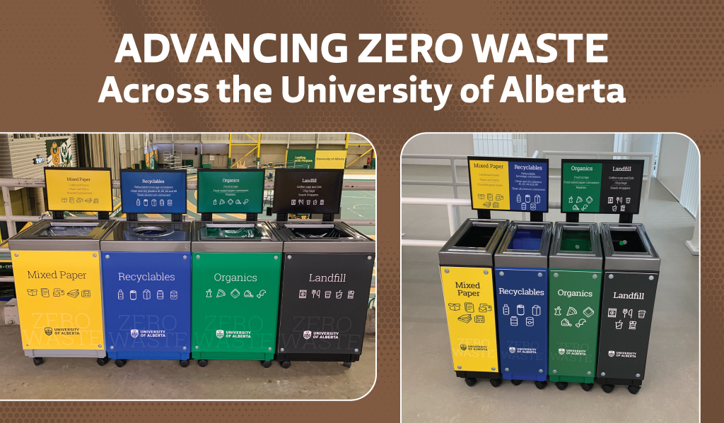
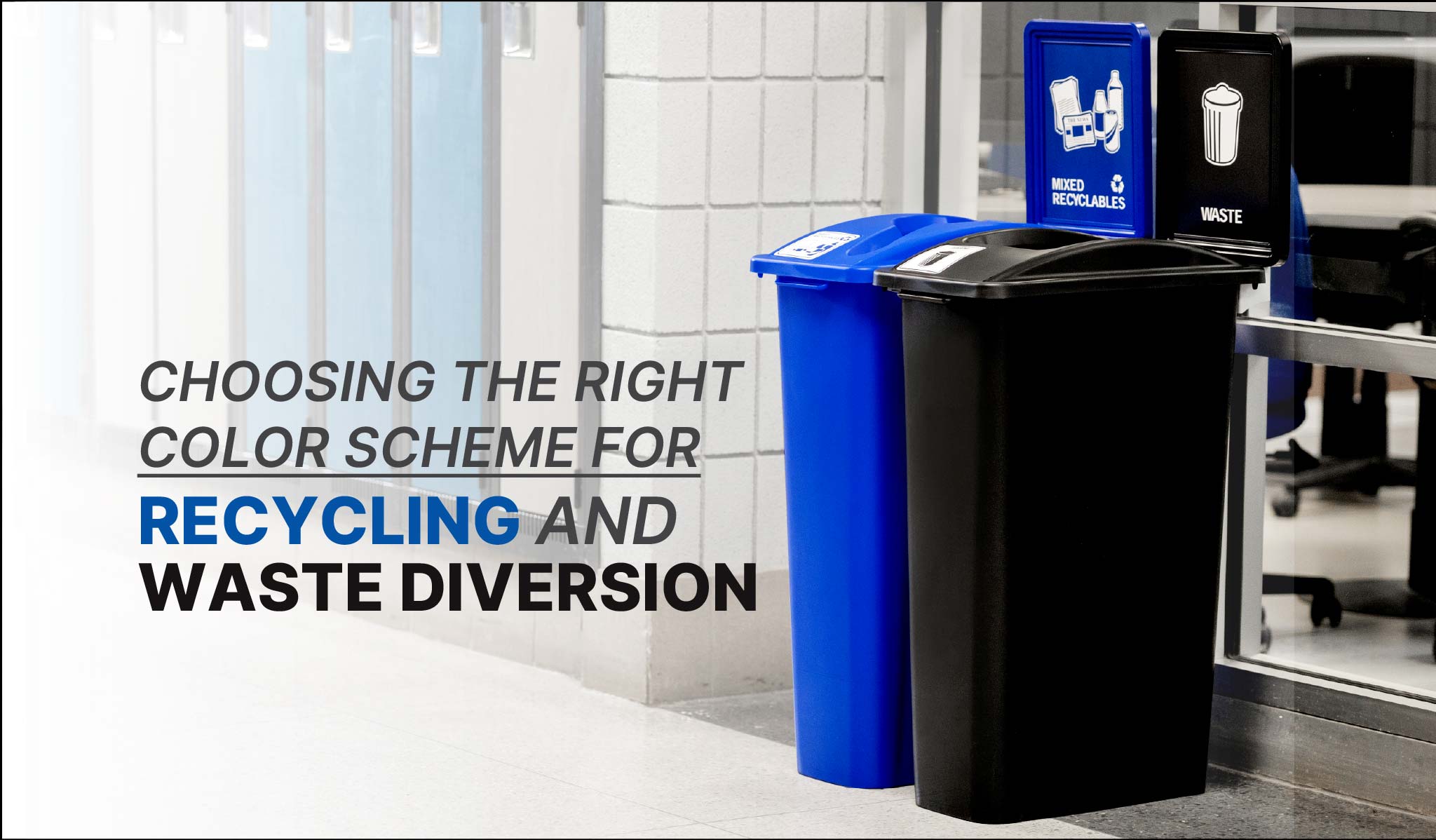
- Blue – Recycling
- 85% of people recognize blue as recycling. Bin Standards Fact Sheet
- Green – Organics or compost
- 81% of people recognize green as compost. Bin Standards Fact Sheet
- Black or Gray – Landfill waste
- Brown – Organics (commonly used in municipal programs)
Why Consistency Is More Important Than the Color Itself
Research and industry best practices show that consistency is often more important than the specific color you choose. When every recycling bin across a facility is blue, and every landfill bin is consistently black or gray, users begin to recognize patterns and make quicker, more accurate disposal decisions.
On the other hand, inconsistent colors can create confusion. If recycling is blue in one building but green in another, users are more likely to second-guess themselves or dispose of materials incorrectly, increasing contamination rates.
Maintaining the same colors across offices, cafeterias, classrooms, hallways, and outdoor spaces helps build familiarity and encourages long-term recycling habits.
Color Alone Isn’t Enough
Although color is an important visual cue, it works best when combined with other design elements. High-performing waste diversion stations typically include:
- Clear, image-based signage showing accepted materials
- Simple, easy-to-read labels
- Restrictive lid openings that match the intended waste stream
- Consistent messaging throughout the facility
Together, these features create a waste station that is intuitive for users, even if they are unfamiliar with your recycling program.
Design Your Waste Stations Around Your Users
Before selecting a color scheme, consider who will be using your waste stations. Schools, airports, offices, healthcare facilities, and public spaces all generate different waste streams and may require different signage or collection systems.
It’s also important to review your local recycling guidelines. Aligning your colors, labels, and accepted materials with your municipality or waste hauler helps reduce confusion and ensures collected materials are processed correctly.
Build a Waste Diversion Program That Lasts
There isn’t a universally “perfect” color scheme for every facility, but there is a proven formula for success: keep your colors consistent, your signage clear, and your messaging simple.
When facilities combine standardized colors with effective signage and thoughtful bin design, they create recycling stations that are easier to use, reduce contamination, improve diversion rates, and support long-term sustainability goals.