Recycling seems simple. You finish a drink, look for the right bin, and toss the container in. But in reality, that quick decision is shaped by a lot of small factors happening all at once, including the effectiveness of recycling signage. Researchers have spent years studying this exact moment; what makes someone choose recycling over trash, and one thing is clear: it’s not just about good intentions.
It’s about what people see, understand, and notice in the few seconds before they throw something away.
One of the biggest influences is convenience. If a recycling bin isn’t right beside a trash bin, most people won’t go out of their way to find one. But even when both options are available, mistakes still happen. That’s where signage plays a role.
The question is, what kind of signage actually works?
Testing Different Messages
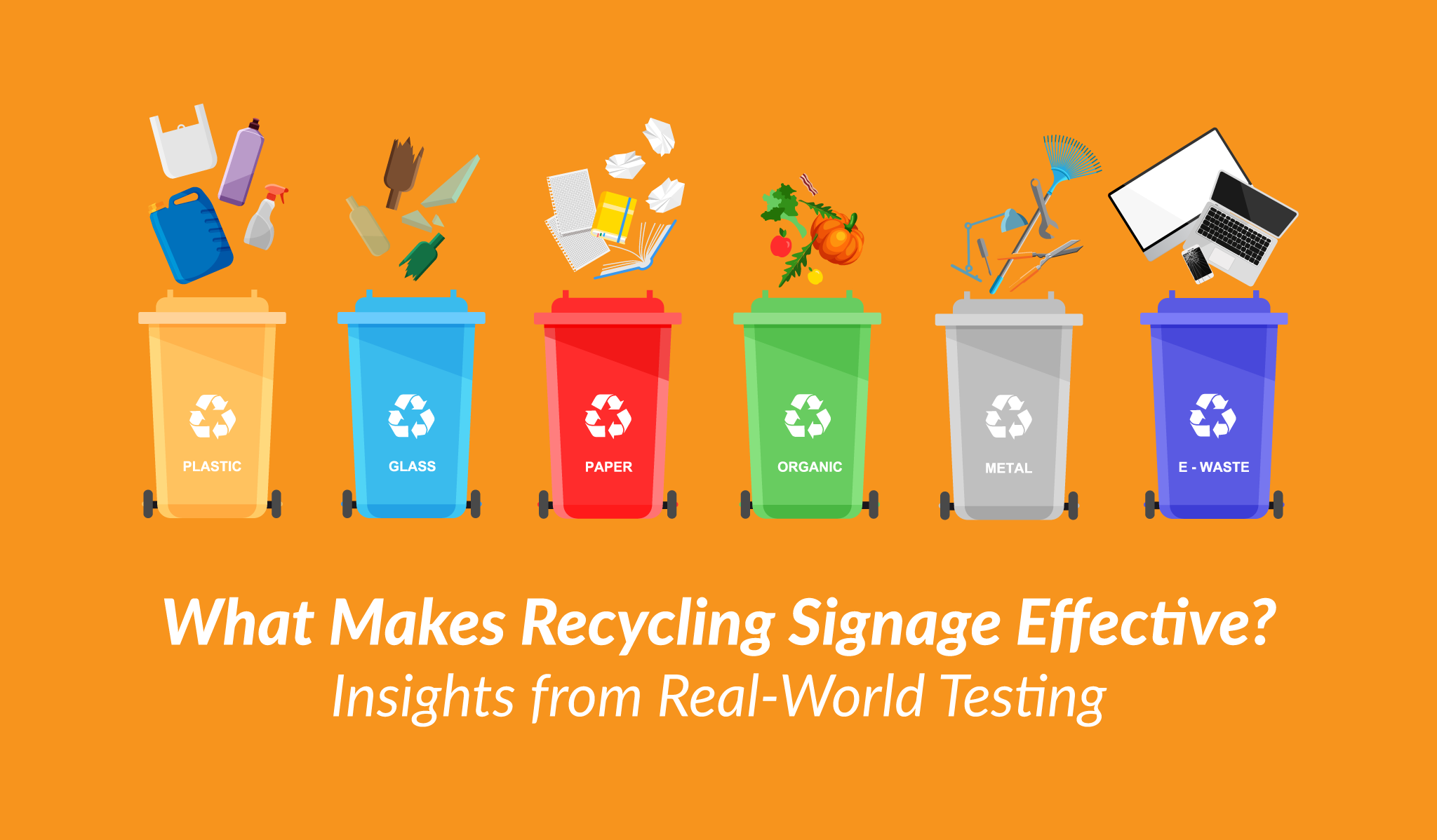
A real-world pilot project at the University of Georgia set out to answer this. Different types of signs were placed above recycling and trash bins in campus buildings to see if certain messages would improve sorting.
Some signs were simple and informational, listing what goes in each bin. Others tried to tap into school pride by framing recycling as part of campus culture. A third type explained what recycled items can be turned into, like carpets or metal products.
After a month, the results came in.
And surprisingly, no single message clearly outperformed the others.
There were small improvements across the board; less recycling in the trash, less contamination in recycling, but nothing significant enough to say one message was better than the rest.
A More Interesting Takeaway
At first, this might seem like a dead end. But looking closer, something else stands out.
All buildings improved, regardless of the type of message.
So instead of asking which message worked best, a better question emerged:
Did the signs themselves make the difference?
In other words, it may not be what the sign says, but that it’s there, visible, and hard to miss.
Why Visibility Matters More Than Messaging
When people throw something away, they’re usually not thinking deeply about it. They might be distracted, in a rush, or focused on something else entirely. The item they’re holding doesn’t feel valuable anymore, so it doesn’t get much attention.
That means small labels on bins often go unnoticed.
This is where visual prompts come in.
Visual prompts are simple, attention-grabbing cues that guide behavior without requiring much thought. In recycling, that can include colors, symbols, bin shapes, or more importantly, large signs placed at eye level.
Research has shown that when signage is moved higher and made more visible, recycling improves. Bigger signs are easier to spot. Eye-level placement makes them harder to ignore. And when people actually notice the prompt, they’re more likely to make the right choice.
Bigger and Clearer Beats Clever
It’s tempting to think that a creative or persuasive message will drive better results. But at the bin, people don’t have time or attention for that.
They need quick, clear direction.
The most effective signage tends to share a few traits:
- It’s easy to see from a distance
- It’s placed at eye level or above the bin
- It uses bold colors and simple visuals
- It keeps text short and direct
Compare that to a small label on the lid or side of a bin, and it’s easy to see why one works better than the other.
Keep It Simple
One of the most important lessons from both research and real-world testing is this: don’t overload people with information in the moment.
When someone is about to throw something away, they only need to know three things:
- That there are different bins
- What each bin is for
- Which common items belong in each
Anything beyond that, like long explanations or persuasive messaging, can actually get in the way.
That kind of communication is better suited for posters, campaigns, or education initiatives outside of the disposal moment.
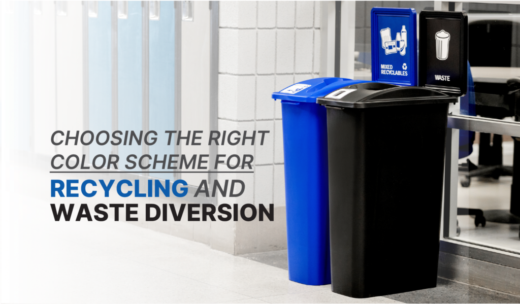
Designed to Be Seen: Custom Signage That Works
At Busch Systems, we believe recycling and waste containers can do more than just serve a function; they can support your space, your messaging, and your identity.
Our customizable bin and signage options give organizations the flexibility to improve wayfinding and create a more engaging environment. Whether it’s a subtle logo, clear color coding, or a bold graphic wrap, customization allows you to combine visibility with purpose, making it easier for people to notice, understand, and use your system correctly.
When done right, it’s not about adding more information; it’s about presenting the right information, in the right way, at the right moment.
The Bottom Line
If you want to improve recycling behavior, start with visibility and clarity, not complexity.
Adding clear, eye-level signage can make a real difference, even without changing the message itself. When people notice the bins and instantly understand what to do, they’re far more likely to get it right.
In the end, effective recycling signage isn’t about saying more; it’s about making the right action obvious, even when no one is really paying attention.
Other Resources
Signage Placed Above Bins Improves Recycling | Busch Systems