This blog is part of a series of conversations between Busch System’s Senior Advisor, Alec Cooley and Brenda Pulley exploring the science of recycling behavior in relation to bin and signage design. This is the first part of a three-part series – you can find PART TWO of the series here, and PART THREE of the series here.
Alec: Welcome to the second post in our ongoing blog series exploring the intersection of recycling behavior and bin and signage design. Our goal with these is to build a bridge between the academic world and that of “practitioners” (i.e. recycling and facilities managers). As we observed in our first installment, a lot of research has been done to understand what influences people’s decision to recycle but the resulting knowledge too often remains trapped in dense academic papers. We’ve taken it upon ourselves to try distilling the abstract concepts and jargon from these papers down to the key takeaways that program managers can actually use to design better collection programs. With this blog we dive further into the question of what and how to present information on bin labels and signage. Specifically, is there an advantage to using words versus images?
To explore this I’m again joined by my fellow Keep America Beautiful alumnae, Brenda Pulley.
Welcome, Brenda!
Brenda: Well, thank you, Alec. This is exciting to have not just a blog but a full-blown “blog series”.
Alec: I know. It may not be as cool as saying you’re a “tech entrepreneur”, but mentioning you write a blog series at social mixers makes you feel hip and current.
Brenda: Unless the other person is an actual tech entrepreneur. Then you just sound like a regular person catching up to a 15-year old trend.
Speaking of social mixers, quite exciting that we can start to mix socially again. Have you done anything “normal” since getting the vaccine?
Alec: We actually went to our first concert in close to two years. The Preservation Hall Jazz Band played a local festival last month. It felt great, if still a little weird to be in a crowd. But I loved the music, it reminded me how much I miss New Orleans. How about you?
Brenda: Ooh, jealous! Actually, I can trump that. I just got back from a road trip with my parents to see a gospel festival in Missouri. It was a sea of elderly, immune-compromised people. Thank God for the vaccine.
Alec: You win, I can’t compete with a gospel festival. Let’s hope this Delta variant doesn’t drive us back into our bubbles…
Literature Review for Recycling Studies Comparing Photos, Icons or Words
Alec: I’ve been looking forward to this topic because I feel there are a lot of assumptions about using images versus words to depict recyclable items on signs. But is there actual science to back them up?
Brenda: Agreed. If you poll recycling sign aficionados most will give their opinion that using photos or icons is more effective than words to influence sorting behavior. If you ask why that is you might hear a theory about the decline of western civilization and how no one reads anymore. The more inciteful among them may hunch their shoulders guessing people just cognitively process images better than words.
Alec: It could be both, but let’s focus on the cognitive angle.
So are these assumptions correct? To get to the bottom of this we tasked our team of interns with scouring stacks of academic journals for relevant studies.
Brenda: By “team of interns” you mean ourselves. But keep going…
Alec: We identified seven studies that touch on this question in some way. Of these, four stand out as worth diving into further here. Let’s start with a recap of each.
Shahri, Vandenbergh & Samuels (2018): “Recycling Signage: Format for Effective Guidance for the Penn State Community”
Brenda: The first is an unpublished study from a Penn State team.
Alec: Shout out to our friend, Lydia Vandenbergh, who works in their sustainability office.
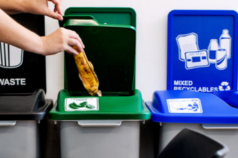
Brenda: They did a computer-based survey, asking 1,200+ people how they would sort certain items based on signage graphics they were shown for 4 separate collection streams (Paper, Plastics, Organics and Landfill). They were shown three different sign conditions: one combining written category labels and photos of specific acceptable items, the second combining the same written category labels with stylized icons, and the third just showing the words with no images.
Alec: When the results were averaged for each of the streams, photos scored the highest sorting accuracy followed by icons. True to assumptions, the words-only condition resulted in the poorest accuracy. But when they looked at the Organics stream in isolation the results were actually flipped on its head – words outperformed icons and photos for sorting accuracy.
Brenda: Whoah! Didn’t see that coming.
Alec: Me neither. Other noteworthy observations: regardless of sign condition, the Organics stream was the most contaminated, followed by Plastics. Coffee cups stood out as the item with the lowest sorting accuracy.
Brenda: Let’s park this and move on to the next paper.
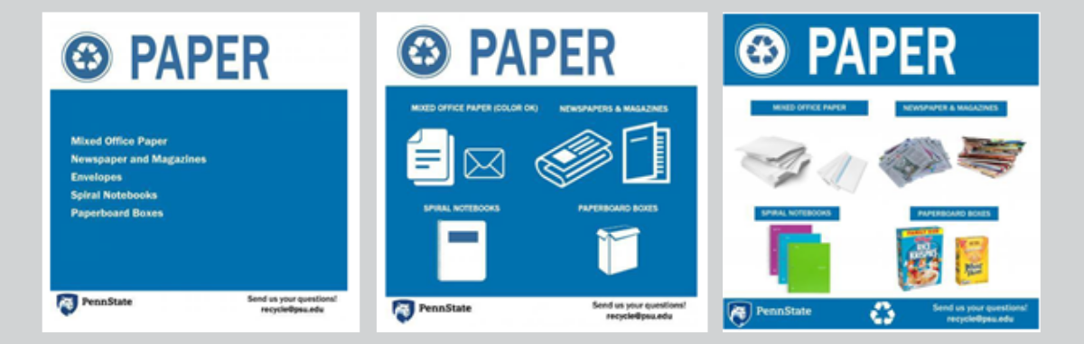
Examples of sign conditions from Shahri, Vandenbergh & Samuels study.
Wu, Lenkic, DiGiacomo, Cech, Zhao, Kingstone (2018): “How does the design of waste disposal signage influence waste disposal behavior”
Alec: This paper was written by a team at the University of British Columbia and actually covers three related studies, all computer-based and conducted in the lab. All three are worth discussing at some point, but our interest for the moment is with the first two. Similar to Shahri, Vandenbergh & Samuels, it tests the effectiveness of signage using photos only (two separate conditions for color and black and white), icons only and words only (simple, no individual items). Participants were asked to view a series of waste items and indicate which collection stream they belonged in by touching their finger to the appropriate choice of signage shown on the screen (“Paper”, “Recycling” (cans and bottles), “Garbage”, “Compost”.
What makes this study interesting is that touching the screen triggered motion detection software that went beyond tracking accuracy to precisely measure the time it took to make the selection. Their reaction time was then divided by the accuracy of their choice to calculate an “efficiency score”.
Brenda: I think this is important, let’s come back to this.
Alec: The study found no difference in accuracy between the image conditions (75%), but all three of these did better than word-only (70%). Measured by efficiency score, words did significantly worse than photos and icons.
Its also worth noting performance for the respective waste stream. Again, the compost / organics stream had the lowest accuracy (69%) compared to garbage (73%) and the two recycling streams (both 77%). Garbage had the worst efficiency score followed by compost, then “recycling” (cans and bottles) and Paper doing the best.
Their second study essentially replicated the first, but went an extra step to test the impact on sorting when signage for different streams were presented in a consistent versus random order (spoiler alert: consistent positioning of signage led to better sorting than random order. More on this another time). It also found that photos and icons beat words.
Brenda: So again, images outperformed words, and compost remains the biggest challenge for sorting.
Alec: Yup.
Ahmed, Khanani & Koshy (2016): ”Comparative Analysis of Visual Triggers in Waste Management”
Brenda: The third paper takes the images vs. words question out of the lab and into the field. This study looks to have been a grad-student project done at the University of Toronto Mississauga. They tested separate signage placed above centralized collection bins (two streams: trash and cans and bottles) in two academic buildings. First they used words-only signage (simple: “Waste”, “Recycling”) for a week, before trading them out with similarly generic icon-only signs (image of trash can, image of can and plastic bottles) with no corresponding words. For the third week they reverted to the original written “waste” and “recycling” in large print placed above photos of a handful of items (showing specific brand names: Minute Maid orange juice, Doritos chip bag, etc.) Beneath each of these photos in small font were corresponding words (“aluminum cans”, “coffee cups”, etc.)
Alec: The results are honestly a little confusing the way they’re presented. They mention conducting waste audits and measuring the accuracy with which people sorted items, but then only present results based on the diversion rate. These showed the generic images-only trouncing the generic words-only, and a third condition with a combination of detailed words and images was comparable to images-only in one building and significantly higher in the other. Comparing the average time to sort, words-only was the quickest followed by images-only, and images + words taking the most time.
Brenda: It’s a little difficult to know what to take from this paper. Without the audit results we don’t know how contamination rates changed or have other context to understand how people responded. Changes to the diversion are interesting, but kind of a blunt instrument by themselves for understanding the impact of the signage.
Alec: Correct, its packaged as more of an observational report than a formal academic study.
George Washington University / Keep America Beautiful Survey (2014)
Alec: The final study is one we’re both familiar with.
Brenda: That’s right. Another shout out, this time to our former colleague at KAB’s recycling department, Kelley Dennings, as well as “friend of the department”, Kaity Phelps, who we worked with on several projects. They spearheaded this study along a GWU professor, Monique Turner, that surveyed over 1,200 people about their associations and expectations for recycling in relation to several bin and signage design factors.
Alec: The results backed up several design assumptions we had about bin color and restrictive lids. But of interest to our topic were questions that presented respondents with various iterations of recycling signage, using different combinations of words and images to represent the same basic mixed recycling stream. People were asked to identify specific waste items they were confident could be included based on what each sign condition displayed. You may want to sit down for this: signs with words and no images performed best in guiding people’s sorting decisions.
Brenda: Stay seated folks, it gets more interesting…
Alec: That’s right, because they also found the word or item depicted with photos influenced people in different ways. Set aside for the moment the results for combined words and photos, and just look at the data for words-only and photos-only signage. In one example they cited, the word “Bottles” led 80% people to include both plastic and glass bottles. But when a photo of a plastic bottle was presented, most people (60%) assumed this excluded glass bottles. Another example, 80% reacted to the word “Paper” by assuming paper bags were included. But shown a photo of a stack of mixed paper the number still confident about including the paper bag dropped by 25%. Third example, 90% of people seeing “Bottles” written out said they’d recycle a soda bottle. But when that sign was replaced with one showing a photo of a water bottle, only 65% of people were still prepared to include the same soda bottle.
Brenda: You start to see a pattern. Verbiage such as “paper” or “bottles” led people to associate individual items with broad categories.
Alec: Correct. Which can be a double-edged sword. Signage saying “Plastic” caused many to assume non-recyclable types of plastic like bags were acceptable.
Brenda: Photos on the other hand, led many people to associate only the items that narrowly matched what they saw on the sign. The study didn’t attempt to answer what caused this, but its a caution flag to keep in mind.
Alec: Exactly!
Brenda: Let’s pause to let that sink in…
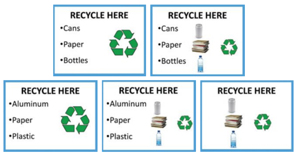
Sign conditions used in GWU / KAB study.
Honorable Mention
Alec: While you’re absorbing that, let me acknowledge the other studies we looked at that touch on this topic of images and words:
- Menzer, Parnell-Wolfe, O’Carroll, & Perkins (2013) – This study involved a partnership of academics and facilities staff at the University of California, Santa Barbara that sought to redesign the signage in use at campus eateries to improve recovery and contamination rates. They measured the performance of different signage in the field, some using both pictures and words and other using pictures exclusively. Their key takeaway was the need to reduce the number of items listed on signage to avoid information overload and to make space for larger display of the remaining images and words. They didn’t, however, go the next step to compare the performance of words versus images.
- Carrico, Fried, Wang, Casper & O’Neill (2017) – A team from the University of Colorado, Boulder did a handful of separate studies to understand recycling and composting behavior, primarily in focused on recreation and athletic settings. One of the studies tested the impact from making simultaneous changes to bin design and configuration as well as signage. Among other things, this paper cites a 15% increase in contamination when photos were placed alongside words on the signs. Unfortunately, the unpublished report we reviewed does not provide details or actual examples of the signage to be able to evaluate these results further.
- Reimer, Roland & Banerji (2018) – And then of course there is the Purdue University project we commissioned during our time at Keep America Beautiful. Among other things, this tested various sign conditions with and without words and images, but found no significant difference between them. You can learn more about this project from our last blog.
And the Winner is…
Brenda: So what are we to take from these studies? Can we simply tally the score like a soccer game, and say images beat words by three studies to one (or technically 1.5 to 3 if you count the organics signs from Shahri, et al.)? The answer, of course, is that it’s more complex than declaring a simple winner.
Each of these studies was designed differently and approaches the question from a unique angle. The amateur statistician in me points out you can’t simply lump their results together to make an overarching statement. Rather, they each contribute a set of narrow results that serve as puzzle pieces. The more pieces that get added, the clearer the picture becomes. And we still have a number of missing pieces.
It’s also worth pointing out this likely isn’t a binary choice. As the GWU / KAB study suggests, there are multiple dimensions to this, where situational factors will call for different game plans.
Alec: Our readers may remember how you called out my use of mixed metaphors in the last blog…
Brenda: Stop living in the past, Alec. These answers are too important to be distracted grammatical niceties. The future of recycling could hang in the balance!
Alec: Now you’re just being dramatic…
Brenda: Tune in next week, dear reader, as we peel back the layers of the onion to reveal underlying truths. Like the promise of vaccines to tame the pandemic, will images be the great hope for recycling? For humanity?? Or like Rome’s siege of Carthage, will words vanquish images and salt the earth to ensure their eternal destruction?
Alec: I just hope this doesn’t end in penalty kicks.
****
Read PART TWO of The Use of Images vs. Words on Recycling Signage series, which reviews the cognitive science of how people process images different from words.
Read PART THREE summarizing the takeaways and recommendations for designing signage.